
The Natural Resources Defense Council recently produced a map addressing environmental justice in Chicago.*

Source: NRDC
Using numerous environmental- and population-related data points across the city, and assessing the “cumulative burden,” the NRDC conveys the inequities of Chicago residents in regard to pollution exposure. As you can see on the NRDC map above, many parts of the city have fared well with minimal exposure to air toxins, wastewater discharge, and the like, along with higher incomes and less proximity to traffic. But for the residents of the yellow, orange, and red areas, it’s likely a different story.
I love maps like this for their illustrative purpose in synthesizing many local data points and showing the quality-of-life differences within just a few city blocks. The NRDC offers some high-level guidance for policymakers to improve living conditions for burdened city residents. (On a related note, Jenny Schuetz of Brookings discusses how the recently released Green New Deal should tackle urban environmental issues more specifically.) The NRDC calls for investing more in the lower-income parts of the city (mainly the south and west Sides) side to mitigate the environmental hardships, calling attention to the city’s zoning-change on the north side to accommodate what has become the Lincoln Yards proposal, while also approving more industrial development on the near and far south side.
My feeling is that, unfortunately, some of these industrial businesses have a lot of sway with their local aldermen, and it might be a tall order to have them change their tack (e.g. shift to greener types of production/reduce emissions), no matter how much money (e.g. tax credits) they receive, to improve their environmental influence on an urban area. Relocating only shifts the burden to another area, and the option to spread industrial complexes across less burdened areas is also limited by the existing residential areas as well as the heavy political firepower that wealthy residents in these areas tend to have at their fingertips. Many neighborhood groups, such as LVEJO and N4EJ, strongly advocate for environmental justice in the highly burdened areas, and I hope people from the less burdened areas follow suit to advocate alongside these groups for citywide justice.
With all of this in mind, I sought to compare the NRDC’s environmental aggregation with several other data points (transportation, education, etc.) from across the city. There have been numerous equity/justice-related studies, so my purpose here is to show if these other urban factors contribute to environmental hardship and if they are equitable themselves. I’m beginning with transportation access today and then will examine related topics in future posts.
One of the important words I use throughout is “access,” meaning that if people have the time, patience, funding, and physical energy, they can partake in any of these transportation modes. However, many people do not have all four, or even one, of these benefits. They are also burdened when trains and buses have long headways or inadequate scheduling, when they have to walk a long distance just to get to a station, and when they cannot afford a transit ride.
Initial Observations of NRDC Map
When I first looked at the NRDC’s map, the first thing I noticed was the how the industrial corridors (highlighted on the map) and/or the highest-burdened areas were along rail lines, expressways, or waterways, many of which you can detect, to some degree, by the curved or angled shapes of the corridors. It’s no surprise that industrial corridors have proximity to these transportation passages for shipping purposes, whether they be current or legacy.
When it comes to personal transportation, many city residents have to venture through these same areas to get to their destinations. For example, many of the rail lines adjacent to the industrial areas also serve various Metra routes, which have numerous, albeit not enough, stops within the city limits. The south branch of the CTA’s Red Line also is in a heavily burdened area for much of its length, and I believe this is due to the massive dozen-lane Dan Ryan Expressway crevice, which the Red Line bisects. Similarly, the largest heavily burdened area is the stretch extending southwest from downtown to the city limits – this is the corridor formed by the Chicago Ship and Sanitation canal, which runs parallel to the Stevenson Expressway, which in fact was partially built in the former bed of the abandoned Illinois & Michigan Canal. This part of the city forms a large gap between residential neighborhoods and can make for a less-than-ideal living situation for the households within or adjacent to its boundaries despite there being various transportation options. Although the proximity of certain transportation modes may be a contributing factor to heavily burdened areas on the NRDC map (more on that later), there is minimal correlation with overall transit access and environmental burden.
Chicago Transportation Access
On the surface, transportation access (and therefore equity) in Chicago is great, as nearly every residence is within a half-mile of a bus or rail system, with 100% of low-income-designated housing units being near transit. Many Chicago residents rely on public transit as their main (and often only) form of transportation. The CTA has a broad-reaching network across the city, and Mayor Rahm Emanuel has taken strides to improve overall transit service and infrastructure.


Source: https://alltransit.cnt.org/
Yet, nearly one-fifth of Chicago residents are underserved by transit access. The Center for Neighborhood Technology recommends closing this gap by increasing transit frequencies or adding new routes, a move with which I agree. (Numerous groups, such as the CNT, the Active Transportation Alliance, and the Transportation Equity Network, also have been pushing to improve overall transit access.)
CTA Bus Access


Source: City of Chicago Data Portal
For bus access, most residents can reach the CTA network within four blocks, as Chicago’s grid design allows for busier streets (and thus, bus routes) every four to eight blocks within the majority of the city. As a result bus stops are fairly common in any part of Chicago, as shown in the images above. Many of the bus routes follow the old streetcar and trolley bus patterns from long ago.
However, not all bus schedules are alike. Eighteen bus routes run 24 hours a day, while others have limited runs aside from weekday rush hours or don’t operate on the weekends. In addition, though many buses provide an essential, cost-effective means of transit, they tend to get stuck in traffic, slowing down overall service, which has led to bleeding ridership. Efforts to expand dedicated bus lanes outside of the Loop have been met with opposition, though city officials are also trying to fix that.
With its ubiquity citywide, the bus network also travels to and through NRDC’s heavily burdened areas, so there is no issue with a lack of access in these areas. That said, though the equity for bus access is apparent across the city, it could be better. It’s difficult to say that the bus contributes to additional hardships on top of the heavily burdened communities. Even though older buses emit dangerous elements, many other buses are hybrids that operate on a combination of electricity and gas. Overall, their service is vital to residents of underprivileged neighborhoods, not a hindrance.
Contributes to additional environmental burden: In general, no.
Equitable mode for city residents: Yes, though not all schedules and routes are equal.
CTA Rail Access – The L

Source: CTA
For the CTA rail lines, aka the L, many residents also have good access, in that they live a half-mile away from a station. Others efficiently connect to a station via the bus, but as mentioned above, riding the bus has its issues in terms of speed and timing. A key benefit of the L versus the bus is its dedicated rail right of way and continual service during hours of operation; ideally, riders should only have to wait for no more than 15 minutes for a train, even on Sundays.
The drawback is that the L can only go where the tracks take it, and Chicago’s old hub-and-spoke rail design prevents any crosstown rail travel that doesn’t include a trip through downtown. Establishing new L routes where no railways had been previously, or even L stations, is bound to be faced with residential resistance of some sort, even if it will benefit the greater neighborhood and the city altogether. The CTA’s Red Line extension to 130th St., though not perfect, follows existing rail beds, and therefore won’t require imminent domain decrees to build as with expressways in the 1950s; with the improved access to a rail line, residents in the areas served by the extension are projected to see a bump in social and economic benefits.
Overall, in terms of speed and service, the L provides a cost-effective and equitable means of transportation. But in terms of access for all, it is lacking, particularly in certain parts of the northwest, southwest, and southeast sides.
Regarding the environmental impact of the L, while it contributes to noise for sure, the L is a clean mode of transit, in that it doesn’t directly emit fumes. It benefits the neighborhood from both an environmental and social perspective than detract from it. Although the CTA’s Orange Line and portions of the Red, Blue, and Green Lines cross into the mid to heavily burdened areas, very few of the deep-red communities on the NRDC map are far from an L line. Thus, like with the bus, it’s difficult to say the L (whether it be lack of access or environmental impact) contributes to additional hardships for these residents.
Contributes to additional environmental burden: No.
Equitable mode for city residents: Mostly, though some areas lack nearby access.
Metra Rail Access

Source: Metra
Like the L system, Metra’s network is also based on the old hub-and-spoke system, despite there being a handful of freight lines that cut through the city outside of the Loop. The Metra complements CTA service to a degree and serves a lot of municipal areas, though it could be more. Metra access is on the positive side, relatively speaking, particularly for the Metra Electric line, which has many stops on the south and southeast sides.
However, Metra is mainly controlled by suburban-appointed board members, who tend to give priority to serving suburban residents despite the thousands of Chicago residents who ride the Metra every day. This hinders the potential for improved city access, such as additional stops, because Chicago is not a priority for the board members. Metra also has no single owner of its rail lines, which can lead to different experiences for riders depending on the company (e.g. Union Pacific, BNSF) that owns the particular line. Despite being part of the RTA along with the CTA, there is no single integrated fare system between Metra trains and CTA trains and buses, creating a cost-ineffective experience for residents who have to pay both the higher-cost Metra fare and the regular CTA fare if they use both systems on a single trip. In addition, because of the suburban priority, Metra provides infrequent service with long headways during non-rush hours even though city residents could greatly benefit from frequent, non-rush service.
As stated earlier, many of Metra’s lines pass through industrial corridors, due partly to the fact that the rail rights of way were established over 100 years ago, and like with the L, building a new line would be met with fierce opposition. Unlike the L, most Metra trains emit soot and exhaust and are loud because of the diesel engines, contributing to the environmental hardships in the already-heavily burdened areas defined by the NRDC. But not all areas served by Metra diesel engines (e.g. Beverly and the north side) are in the yellow/red on the NRDC map, and on the south and southeast sides of the city, where the non-diesel Metra Electric and a number of freight lines pass through, the environmental burdens are fairly low (aside from the Calumet River and Lake Calumet areas). Still, proximity to diesel rail traffic isn’t necessarily a positive for environmental conditions in heavily burdened areas, though it could help in taking single-occupancy vehicles off the road, thus reducing carbon emissions in a given area.
Contributes to additional environmental burden: Yes, depending on location.
Equitable mode for city residents: Somewhat, with much room for improvement.
Bike Access
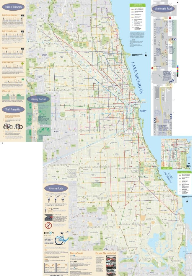
Source: City of Chicago
If talking about transportation, Chicago has certainly increased its focus in the last couple of decades to serve cyclists through various initiatives. Bike infrastructure has improved, as more streets have dedicated bike lanes and more trails have been built or improved to serve higher volumes of bike traffic. Advocacy groups, such as the Active Transportation Alliance, are also making large efforts to improve conditions and encourage biking throughout the city. Plus, it goes without saying that conventional bikes have zero carbon footprint.
The city’s overall goal is to make biking a reliable, equitable option for all Chicagoans. Yet, there are some drawbacks as many city streets still lack bike lanes and aren’t safe for everyday people, which actually spurred the creation of the Mellow Bike Map. In addition, police issue the most bike violation citations in non-white communities, many being the same areas that the NRDC designates to have high environmental burdens. The unfortunate irony here is that residents among the worst environmental surroundings are getting penalized for taking the greenest mode of transportation. Now that this police activity has come to light, we’ll see if the skewed citation activity continues.
Contributes to additional environmental burden: No.
Equitable mode for city residents: Mostly, but depends on having access to a physical bike and also on where residents live.
Interstate Access

Source: The Geographic Society of Chicago. Note, I hate how this is in Comic Sans, but it is a no-nonsense map with nothing but expressways, which is why I used it.
I mention the expressways here because of their high-volume daily vehicle flow, and the fact that about 80% of Chicagoland residents commute in cars each day. Thus, expressways allow for a means of transportation (cars) to commute throughout the city. If expressways are to be considered as part of transportation equity, then most residents of the city have relatively good access (i.e. a less than 10-minute drive) to at least one interstate, save for some neighborhoods on the southwest side and the north side. Thus, the majority of city neighborhoods are minimally burdened when it comes to traveling by car on high-speed interstates within the city limits (assuming no traffic, which never happens). For people who live close to Lake Michigan, they also treat Lake Shore Drive as an interstate even though the road was never intended to serve as an interstate substitute.
However, there are a few problems with saying expressways are all-positive. One, to use an expressway, one needs to own, rent, or hire a car, all of which are costly endeavors for various low-income people. Two, it has been well-documented how expressways destroyed the residential livelihoods of many neighborhoods, so saying they offer an equitable mode of transit is misleading. Third, with continuous vehicle exhaust 24/7/365, expressways directly contribute to negative environmental conditions. With the exception of the Oriole Park community on the far northwest side, most neighborhoods adjacent to expressways have at least a midlevel environmental burden, according to NRDC’s data. Last, two words: induced demand. Take away the expressways, and fewer people will drive. With fewer people driving, more will use other, more equitable, greener modes of transportation.
Many cities have begun to rethink their interstate systems and give less priority to individual cars and more priority to public transit and pedestrian/biking options. In Chicago, I don’t think its current expressway network is going away anytime soon, but at least the city has taken steps to improve transit and bike infrastructure and service.
Contributes to additional environmental burden: Yes.
Equitable mode for city residents: Depends on perspective. Cars can provide immediate transportation benefits when it might be difficult to use transit, but the long-term costs are far higher than other modes, making it not equitable for many people.
My Experience Living Next to an “Industrial Corridor”

Source: DNAInfo Archives
Until recently, I lived immediately adjacent to the narrow industrial corridor denoted on the NRDC map with a north-south pattern on the city’s north side. This is the Ravenswood Corridor, which would not have existed if it weren’t for the Union Pacific tracks that bisect it along Ravenswood Avenue. Thing is, while the area is technically industrial, it is minimally pollution-inducing. Rather it is teeming with art and music studios, breweries, and restaurants, which benefit from the gradual northward shift of wealth from the city’s inner core as more residents have elected to stay in the city beyond their 20s compared with a couple of decades ago.
But what makes the Ravenswood Corridor unique is its proximity to wealthy neighborhoods, the fact that there are only two train tracks (formerly three back when the Chicago and North Western owned and operated the tracks with local and regional trains), and the fact it is nowhere near an expressway. Most important, the railroad is passenger-only, with short trains that stop at the Ravenswood Metra station, unlike other areas of the city with multi-engine freight trains hauling loads at all hours. These factors allow the Ravenswood Corridor, this “industrial” part of the city, to feel quite pleasant.
The only other industrial corridor on the NRDC map that I see benefiting from similar factors is the stretch from Jefferson Park to Edison Park on the far northwest side, where another all-passenger Union Pacific line serves the neighborhoods.
One slight drawback from living right near high-traffic railroad tracks is the actual trains, even if they are short commuter trains. While the noise of the trains wasn’t really a nuisance – I absolutely love all kinds of trans, and in fact, I could often tell what time it was when I heard a train pass – what was annoying was the aftermath stench of the diesel engines’ exhaust. Choose any day with the windows open, especially if I were downwind or it were humid outside, and those fumes would carry directly into the apartment and stay for a few minutes. But what about the residents in the NRDC’s heavily burdened areas who are exposed not only to regular diesel train exhaust, but also emissions from trucks and factories?
This is what the NRDC data was getting at. Indeed, my wife and I chose to live where we did and could’ve lived elsewhere. But many city residents don’t have that choice due to various social or economic reasons and may end up living in an environmentally heavily burdened area. Although not every economically disadvantaged household resides in heavily burdened parts of the city, other hardships exist, and I’ll explore this in future posts, as previously discussed.
As for transportation access, very few city residents are “burdened” overall, and there is minimal compounding effect of living in a “highest burden” environmental area and having less than efficient access to transit. The city continues to make improvements, but it can do more. A handful of Chicago mayoral candidates recently discussed their plans for citywide transportation. We shall see how this election unfolds and what the victor’s ultimate transit policies are.
* The NRDC produced the map in 2018, but I credit CityLab for recently bringing it to my attention.
Note: The headline image I took from the platform of the CTA’s Pink Line California Stop, which is located in a heavily burdened area according to the NRDC.

2 thoughts on “Environmental Justice and Transportation Equity in Chicago”